Enterprise OT Security
2022–2024 · Dashboard & Web design
SecurityOne is a placeholder name used for confidentiality. Tap any phase to see what happened in it.
- Enterprise UX
- Information Architecture
- Interaction Design
- Design Systems
Overview
Designed for OT environments: clearer triage and safer action.
- Enterprise reality
- Different teams needed different perspectives on the same incident, while working within strict security and operational constraints.
- Workflow First
- People needed one clear path to understand what happened and what to do next.
- Cross Product Context
- Information from different tools came together in one place.
Challenge
Operators were making high-stakes decisions with fragmented signals and limited visibility. The challenge was to improve clarity without increasing cognitive load.
Decision
Prioritized triage structure over visual polish with clearer hierarchy and ownership cues. Key tradeoffs: speed vs. certainty, automation vs. control.
Impact
Established triage patterns that improved decision clarity and made handoffs more consistent across teams.
At a glance
Scope
- Context: B2B · enterprise cybersecurity software for industrial environments
- Product: SecurityOne, a unified security platform across endpoint, network, and assets
- Ownership
PRODUCT CONTEXT
Designing for OT environments
Context
Purdue model architecture
The Purdue model gave a shared structure for mapping control layers, operational boundaries, and security responsibility across the environment. It's the structure to define how triage moves through the product, from queue to evidence to action.
This helped align plant, security, and management teams around a common model and made escalation decisions easier to explain and defend.
Workflow
Alert → Correlation → Triage → Investigation → Escalation → Decision
Workflow execution follows interaction best practices: clear focus movement, stable visual hierarchy, comparable data views, and predictable transitions between quick scan and deep investigation.
- cyberFlow
- timeline
COMPONENT BEHAVIOR · LOGIC
Defining how components behave
Joining as the founding designer, I established shared interaction patterns across the platform and balanced constraints with usability.
I explored interaction concepts through focused prototypes and aligned decisions with PMs, engineering, and the IT team before scaling them into reusable product patterns.
- feature
Gallery
- Navigation alternatives tested against users
- feature
Gallery
- Half-page detail while keeping list context.
- Full-page detail when depth beats persistence of the queue chrome.
- feature
Design comparison
Design comparison, tabs vs unified filtering
Comparison criteria were operational: handoff clarity, filter discoverability, cross-domain trace speed, and error recovery after mode switching.
Gallery
- Direction: tabs to separate major data domains.
- Direction: unified list with filter entry points for flexible slicing.
- feature
Gallery
- Interaction study: expansion behavior, scan velocity, and recovery after mis-sorts.
- Selection and bulk actions
- Expandable rows enabling progressive disclosure instead of one oversized detail panel.
- feature

Iteration
These versions show how we balanced data volume against usability. Each iteration makes a specific tradeoff to solve a different problem.
- Maximized data at the cost of clarity: The goal was information density for expert users. However, excessive noise collapsed the visual hierarchy, making critical alerts difficult to distinguish and increasing the risk of user error.
- Prioritizing action over completeness: The focus shifted from showing every data point to enabling faster decision-making. Even with messy or incomplete underlying data, the interface now guides the user toward a reliable judgment.
- A unified model for every workflow: Standardized table and navigation patterns across the platform. Whether scanning a list or performing a deep investigation, the experience remains consistent, scalable, and free of fragmentation.
Component behavior · Sign-in
Sign-in behavior
The first screen is where trust is won or lost. The goal was predictable state feedback for errors, MFA, session expiry, and RBAC, without modal stacking that slows legitimate access during an incident.
Component behavior · Setup and license
Setup and license behavior
Unlike consumer onboarding, enterprise setup focuses on configuring trusted connections before investigation begins.
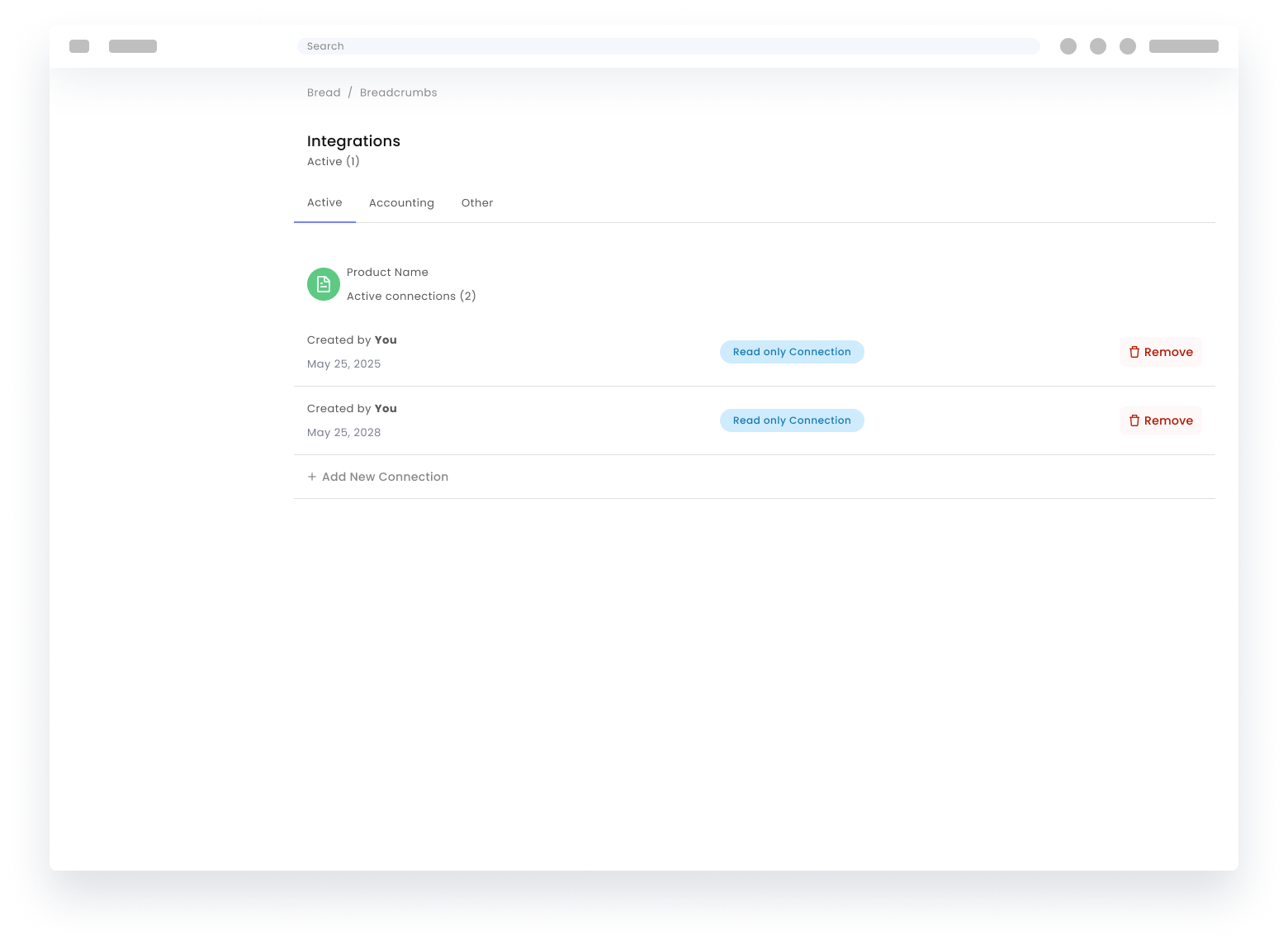
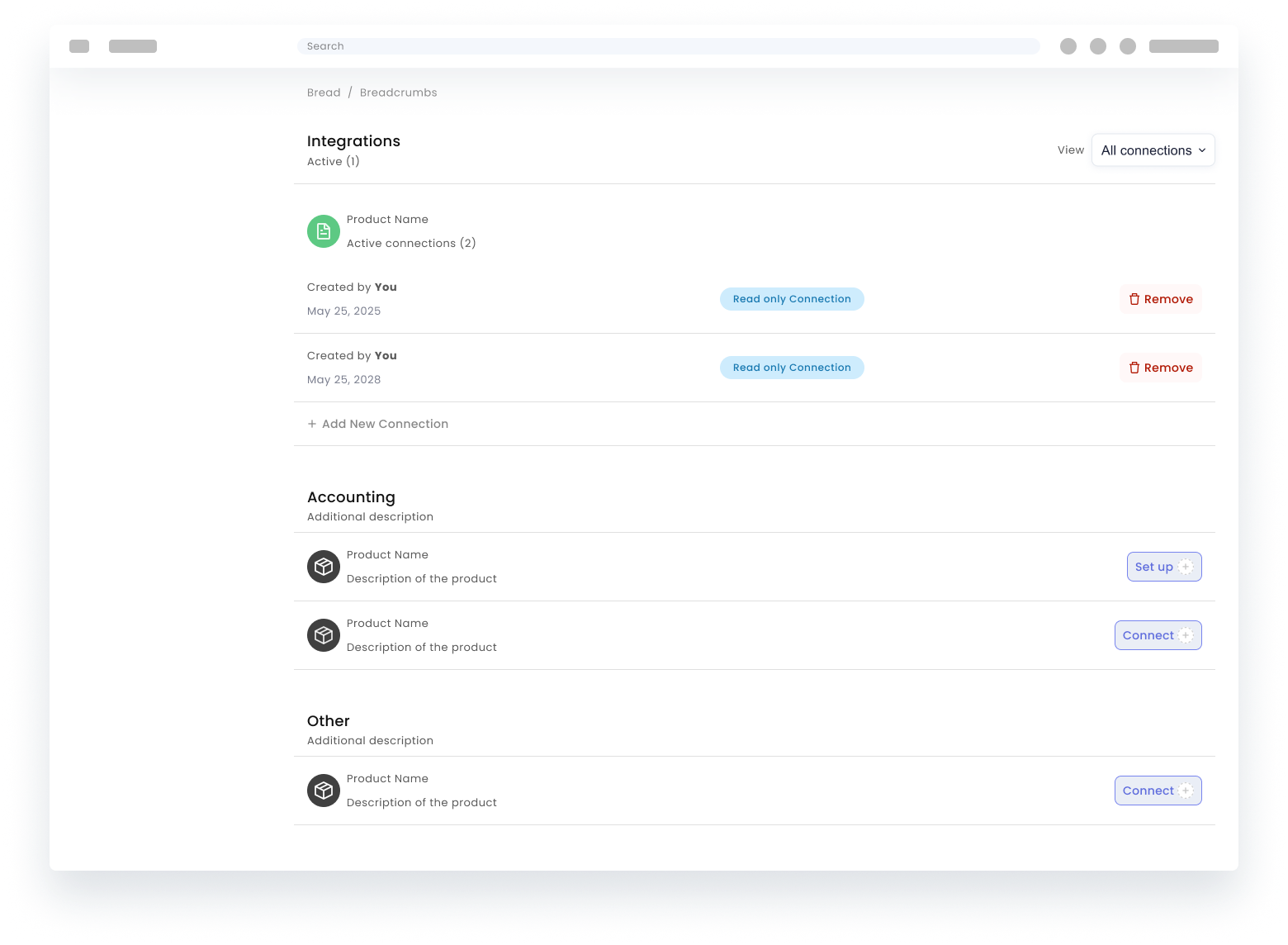
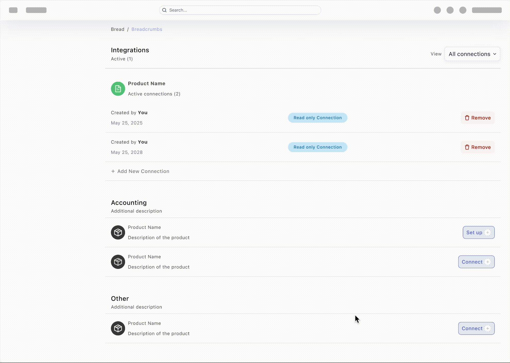
Component behavior · Data tables
DataTables and DataViews
The following sections break down one production workflow into reusable interaction patterns.
Component behavior · Library
The tokens show status, actions, inputs, asset summaries, feedback, and empty states alongside the table anatomy.
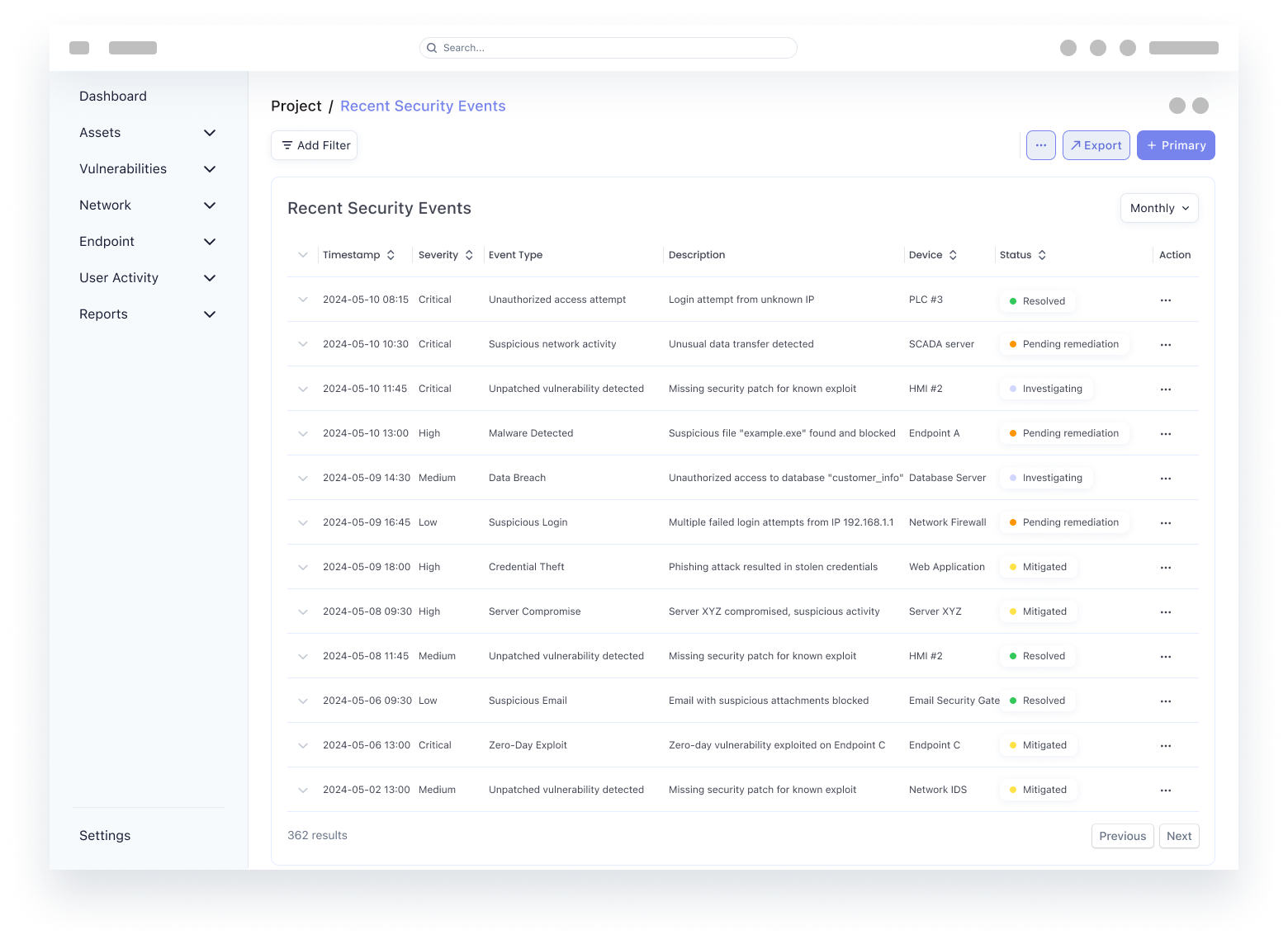
Component behavior · Datatable
Datatable behavior
Runnable queue view with phased tabs and expandable row drills. Matches the framing above so the rationale reads before the interaction.
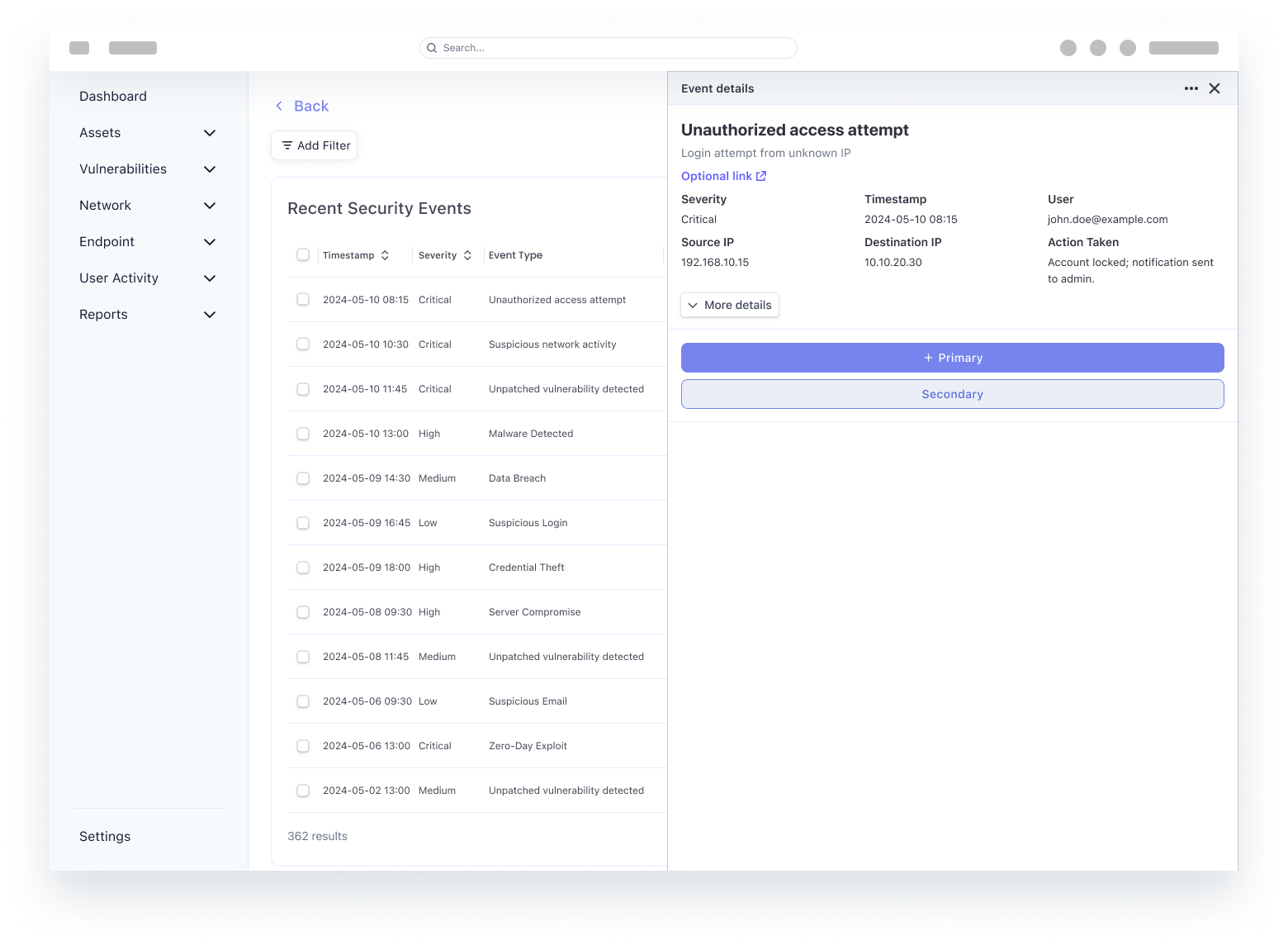
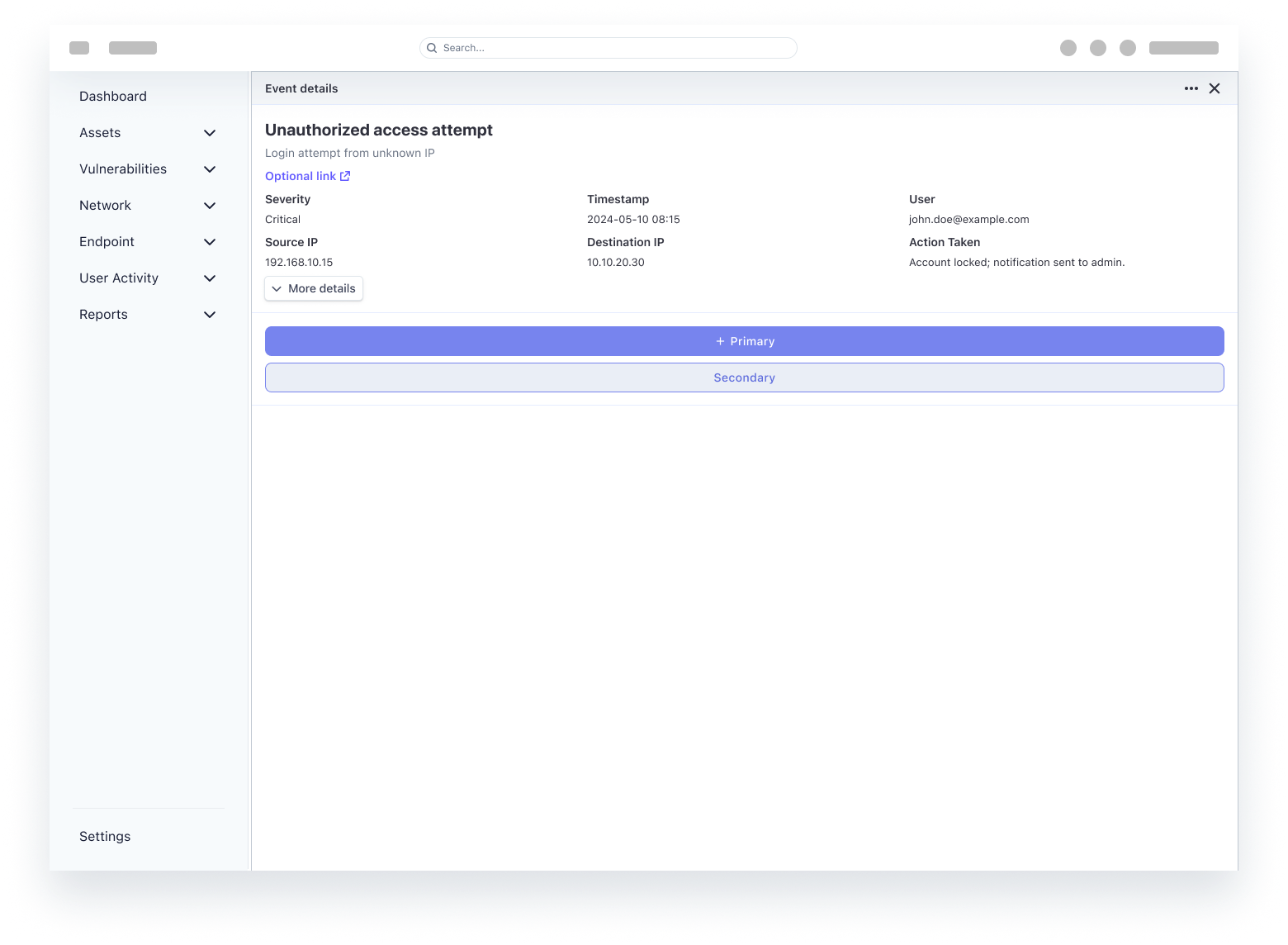
Incident response
Reversible containment
The response path keeps detect and investigate constrained, containment simulated before apply, and rollback one control away.
Component behavior · Charts
Data visualizations
Each view answers one triage question using a distinct chart grammar: ranked bars for magnitude, stacked bars for composition, a line chart for trajectory, a scatter plot for outliers, a heat map for dense two-axis reads, and a donut chart for posture at a glance.
Component behavior · Data viz
Data viz behavior
Standalone chart patterns for hover, filter, pivot, and dense-matrix reads: same grammar as the visuals above in a runnable HTML sandbox.
SecurityOne Concept
Automated security for critical assets
Takeaways
What changed me
- Lesson: Collaboration is the product, not the handoff: Once we integrated the core systems, the focus shifted from delivering assets to solving user problems. When design and engineering speak the same language, the friction of translation disappears, leaving more room for polish.
- Lesson: Clarity beats complexity every time: High-intensity environments don't require more data; they require sharper intent. Good design functions as a filter that surfaces the next right action, changing fragmented info into clear decisions.
- What I now optimize for: In complex security environments, the highest form of craft is anticipating technical constraints and edge cases within the design itself. The focus is on narrowing the distance between the intended experience and the live product.
- The challenge wasn't just shipping features, but collapsing the gap between intent and execution. My design moved from spec-following to shared ownership of the final experience.
- From handoff-heavy specs toward shared ownership of how the product behaves in production.
Reflection
Architecture and next bets
How the OT platform behaves at scale today, what would move toward the edge on a serious second pass, and what would be drafted next once capacity allows.
Redesigning the mental model
The same data, reframed from IT language to operational language.