Related posts
2023 - Design System
Colors in Design Systems
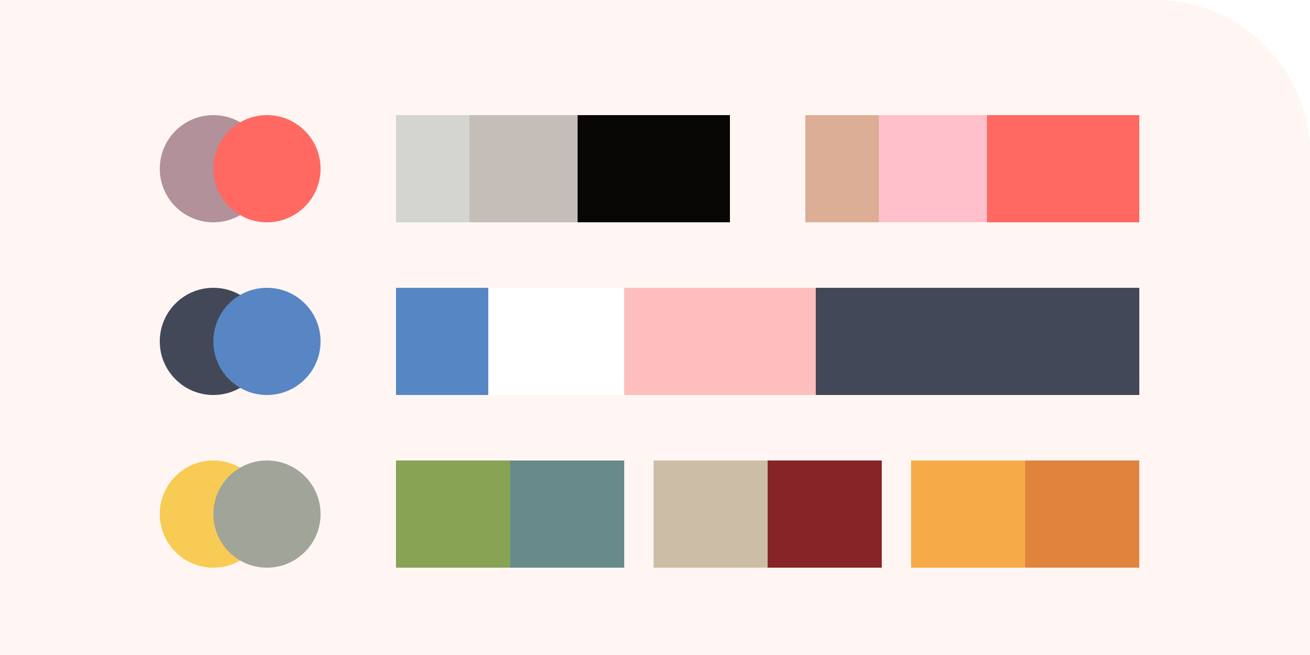
In design systems, colors play a vital role in defining a brand's identity and user experience.
Primary colors are the core brand colors used consistently across the UI, while secondary colors complement and highlight specific elements.
Neutral colors create a majority of the UI, providing support and reducing eye strain. Semantic colors communicate specific purposes, like warnings or success messages.
To create a cohesive design, designers establish a color palette with three to five well-chosen colors.
Testing color accessibility ensures inclusivity and adherence to guidelines. By adjusting hue, saturation, and value, designers can achieve accessible color contrasts that enhance the user experience.
Naming colors with purpose and simplicity aids quick adjustments and easy recognition.
In conclusion, a well-defined color system, combined with accessible choices and simplified naming, forms the foundation of a successful design system.